The Global Font Spec Hierarchy
| Properties: | |||
|---|---|---|---|
| class | class | This property must be set to poly push button. | |
| bounds | rectangle | ||
| enabled* | boolean, integer or list | [W] | |
| contents* | list of integer | The coordinates of the polygon's vertices. (the bounding rectangle) | |
| Return value: | |||
| boolean | True if this button was used to dismiss the dialog, otherwise false. | ||
	-- A triangular push button
{class:poly push button, bounds:[195, 30, 340, 150], contents:[0, 0, 145, 60, 60, 120, 0, 0]}
|
A poly push button is a transparent polygonal area that behaves like a push button. It may be used to effect arbitrary shaped, push button like, dialog items in combination with parts of or whole pict, icon and static text dialog items. In order to activate the button the user must click the mouse within the button's polygon as defined by its contents property, or within the rectangle defined by its bounds property if no contents property is specified.
The contents property defines the coordinates of the vertices of the polygon. It consists of a list of pairs of integers that specify the x and y coordinates of each vertex. The first pair must be duplicated exactly by the last pair i.e. [x1, y1, x2, y2, ..., xn, yn, x1, y1]. Thus a list of 8 integers (4 vertices) defines a triangle. The coordinates of each vertex are specified relative to the top-left corner of the bounds rectangle. This means the button can be relocated by simply using a different bounds setting.
| Properties: | |||
|---|---|---|---|
| class | class | This property must be set to poly toggle button. | |
| bounds | rectangle | ||
| enabled* | boolean, integer or list | [W] | |
| value* | boolean | If true then the button is drawn highlighted. (false) [R/W] | |
| contents* | list of integer | The coordinates of the vertices. | |
| Return value: | |||
| boolean | The current state of the button. | ||
	-- A triangular toggle button
{class:poly toggle button, bounds:[195, 30, 340, 150], contents:[0, 0, 145, 60, 60, 120, 0, 0]}
|
A poly toggle button is a transparent polygonal area, similar to a poly push button, that behaves like a check box (or toggling button). Alternate clicks toggle it between on & off states. In its off state the button is transparent (invisible). In its on state all pixels within its polygon have their colour inverted. See class poly push button for more details.
| Properties: | |||
|---|---|---|---|
| class | class | This property must be set to poly sticky button. | |
| bounds | rectangle | ||
| enabled* | boolean, integer or list | [W] | |
| value* | boolean | If true then the button is drawn highlighted. (false) [R/W] | |
| contents* | list of integer | The coordinates of the vertices. | |
| Return value: | |||
| boolean | The current state of the button. | ||
	-- A triangular sticky button
{class:poly sticky button, bounds:[195, 30, 340, 150], contents:[0, 0, 145, 60, 60, 120, 0, 0]}
|
A poly sticky button is a transparent polygonal area, similar to a poly push button, that behaves like a single radio button dialog item. Clicking the button places it in the on state (value = true) where it will remain unless reset by a script. In its off state (value = false) the button is transparent (invisible). In its on state all pixels within its polygon have their colour inverted. See class poly push button for more details.
| Properties: | |||
|---|---|---|---|
| class | class | This property must be set to poly radio button. | |
| bounds | rectangle | ||
| enabled* | boolean, integer or list | [W] | |
| value* | boolean | If true then the button is drawn highlighted. (false) [R/W] | |
| contents* | list of integer | The coordinates of the vertices. | |
| Return value: | |||
| boolean | The current state of the button. | ||
	-- A triangular radio button
{class:poly radio button, bounds:[195, 30, 340, 150], contents:[0, 0, 145, 60, 60, 120, 0, 0]}
|
A poly radio button is a transparent polygonal area, similar to a poly push button, that behaves like a radio button dialog item. Clicking the button switches the previously on member of the group off (value = false) and places this button in the on state (value = true).
In its off state the button is transparent (invisible). In its on state all pixels within its polygon have their colour inverted. A contiguous set of adjacent poly radio button dialog items form a group. Poly radio button groups are delimited by any other type of dialog item. See class poly push button for more details.
| Properties: | |||
|---|---|---|---|
| class | class | This property must be set to movie controller. | |
| bounds | rectangle | ||
| enabled* | boolean, integer or list | [W] | |
| contents | alias | The file containing the movie. | |
| flags* | integer | Various flags that control the display of the movie controller. (2) | |
| Return value: | |||
| null | This class of item returns nothing. | ||
A movie controller dialog item enables the display of any standard QuickTime movie within a dialog. The flags property allows the specification of a number of display options.
The optional flags property is constructed by adding any combination of the following values together (or setting it to 0 if none are required):
| 1 | Add this value to flags to make the movie controller place the movie into the upper-left corner of the display rectangle specified by the bounds property. The movie is scaled to fit into the rectangle. Note that the control portion of the controller may fall outside of the bounds, depending upon the results of the scaling operation. |
| 2 | Add this value to flags to make the movie controller resize the movie to fit into the display rectangle specified by the bounds property after it places the control portion of the controller into the rectangle. This is the default. If you add this to flags and add 1, the movie controller resizes the movie to fit into the specified bounds rectangle and places the control portion of the controller outside of the rectangle. |
| 4 | Controls whether the movie controller uses a badge. If you add in this flag, the dialog item displays the movie with a badge whenever the controller portion is not displayed. If you don't set this, the dialog item does not use a badge. |
| 8 | Controls whether the controller portion is visible. If you don't add this flag, the dialog item displays the controller along with the movie. If you add this flag, it does not display the controller. If you have added 4 to flags, specifying that it uses a badge, the dialog item displays a badge whenever the controller is not visible. |
| 16 | Specifies whether the dialog item displays a frame around the movie as part of the controller. If you add this to flags, the dialog item displays a frame around the movie, including the movie's name. If you don't add this flag, the dialog item does not display a frame as part of the controller. |
| Properties: | |||
|---|---|---|---|
| name* | string | Name of the font family for this font spec. ("" [maps to the system font]). | |
| size* | integer | The point size of the text. (0 [means use the system font size which is usually 12]) | |
| style* | style | An integer, style name or list of style names indicating the style of the text. (plain) | |
| color* | RGB colour | The colour of the text in [red, green, blue] format, where 0 is no colour and 65535 is maximum colour. ([0, 0, 0] [= black]) | |
	-- This is the default system font spec:
set font1 to {name:"", size:0, style:plain, color:[0, 0, 0]}
	-- It is equivalent to this font spec on Roman script systems:
set font2 to {name:"Chicago", size:12, style:plain, color:[0, 0, 0]}
	-- This font spec produces this style of text
set font3 to {name:"Geneva", size:9, style:[bold, underline]}
|
A font spec can be used to override the default settings for the context (and all sub-contexts) within which it is specified. That is the global default font (the font parameter of dd auto dialog) overrides the system font spec for all DD dialogs, the dialog default font (the font property of a dialog) overrides the global font spec for all text in that dialog, and the font property of a static text overrides the dialog default font for that static text item. Where a partial font spec is used the missing parts are automatically filled in from the next larger context.
Note: Currently the color property is not used by control items which always display text in black.
Note: A later release of DD may include a justification property in font spec objects.
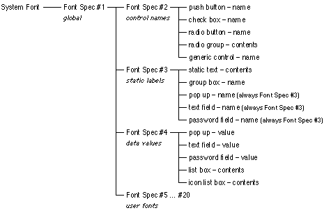
This section describes the global font spec table (font table) that is specified via the with fonts parameter of dd install and dd auto dialog. This is the preferred way of specifying fonts in DD v0.7. The font table provides a hierarchical font specification system that is both flexible and consistent (if initially not completely obvious).
The flexibility comes from the ability of any dialog item to use any font spec (in the font table) by simply setting its font property to the required entry's index. The font table is specified as a list of font specs and null objects. A null indicates that that font spec should inherit all its properties. The font table may contain up to 20 such entries (numbered 1 to 20). All font specs are initially defined to have the same default property settings as the system font (as described in the Class font spec section above).
Further, if the first font spec is redefined then font specs 2 - 20 all default to it initially. Thus, as different classes of dialog item default to using different font specs from the font table, they all initially default to using the system font, unless you define font spec 1 to not be null, unless you define their default font spec to not be null, unless you give them an explicit font spec via their font property.
The tree diagram below shows the font spec inheritance hierarchy in a graphical form. Font spec properties that are not redefined are inherited. Any font spec property definitions further down the hierarchy (to the right) override those defined further up the hierarchy (to the left). The rightmost items are the dialog item classes that inherit the font specs to their left by default, and the properties that are drawn using those font specs.
dd install with fonts [null, {name:"Helvetica", style:bold}, null, null, {name:"Geneva", size:9}]
|
This will cause the names of all control items to appear in 12pt Helvetica-Bold and all other text to appear in the System font, unless their dialog item definitions explicitly specify the font property to be 2 (12pt Helvetica-Bold) or 5 (9pt Geneva).
dd install with fonts [{name:"Times"}]
|
This will cause all text within the subsequently created DD windows to appear in 12pt Times-Roman, regardless of any font spec indexes specified in any dialog item definitions, i.e. it redefines the global font.
This section explains how dependencies (i.e. the enabled property) works. It does not need to be understood completely if you only need to create simple dialog boxes.
Item dependencies allow interactive dialog items to be dynamically enabled or disabled automatically dependent on the state of one or more other items. e.g. The OK push button could be disabled (greyed out) until some text is entered into a text field (as in the password dialog example below). The dependencies of all items are re-evaluated whenever the state of any item changes.
There are four types of dependency: none, initial, single item and multiple items. By default a dialog item has no dependencies i.e. it has no enabled property and it is always active. An expression that evaluates to true or false may be used to set the initial value of an enabled property.
This expression is evaluated only once when the dialog item list is constructed e.g. enabled:(current date) >= date "1/1/2000". A single item (simple) dependency consists of the enabled property being a single integer which gives the index of the dialog item upon which this item depends. (An item's index is determined by the position of the item in the contents property of the dialog record passed to dd auto dialog or dd make dialog.)
Negative values indicate inverse dependencies. i.e. if item 4 is a check box then an item with property enabled:4 would be enabled only when the check box is checked, and an item with property enabled:-4 would be enabled only when the check box is not checked (unchecked).
Values with a magnitude greater than 255 are used to indicate a dependency on a sub-item (such as a radio button or pop up menu item). e.g. a value n = 522 is interpreted as dialog item no. = |n| mod 256 = 10, sub-item no. = |n| div 256 = 2. The following function will calculate the numbers for you:
on SubItem(itemNo, subItem) return itemNo + subItem * 256 end SubItem |
A multiple item (complex) dependency consists of the enabled property being a list composed of an enumeration name (dOr or dAnd) followed by one or more integers as described for the simple dependency e.g. enabled:[dAnd, 3, -5] enables this item only when dialog item 3 is on and dialog item 5 is off.
How an item's on/off state is determined depends on the item's class, as follows:| Class | On when | Off when | Comments | |
|---|---|---|---|---|
| push button | never | always | actionless buttons only | |
| push button | after being clicked | before being clicked | sub-dialog buttons only | |
| push button | action returned != null | otherwise | handler script buttons only | |
| check box | checked | not checked | ||
| radio button | highlighted | not highlighted | ||
| radio group | never | always | ||
| radio group button | selected | not selected | ||
| generic control | value != 0 | value = 0 | ||
| pop up | never | always | ||
| pop up item | selected | not selected | ||
| list box | has a selection | has no selection | ||
| list box item | selected | not selected | ||
| text field | contains text | empty | ||
| password field | contains text | empty | ||
| static text | never | always | ||
| group box | never | always | ||
| pict | never | always | ||
| icon | never | always | ||
| dummy | dependencies evaluate to true | dependencies evaluate to false | ||
| color picker | never | always | ||
| gauge | never | always | ||
| icon button | highlighted | not highlighted | ||
| poly button | highlighted | not highlighted | ||
| movie controller | never | always |
Dialog Director may return a number of error codes that are not part of the standard Mac OS/AppleScript repertoire. These error codes are defined in this section.
| Code | Description |
|---|---|
| 1 | The user terminated the dialog by typing <command> + <control> + 'Q'. |
| 2 | The script tried to open more dialogs then the maximum allowed. |
| 3 | The script called dd interact with user when there were no open dialogs. |
| 4 | The global font table is initially too long or has overflowed. |
| 5 | QuickTime is not installed. Unable to use movie controller item. |
| 6 | Too many, too few, or odd number of polygon coordinates in poly button contents. |
| 7 | The Text Services Manager is not installed. Unable to use floating windows. |
Dialog Dumper is an applet which is a part of the Dialog Director distribution. Dialog Dumper allows you to automatically convert standard Mac OS application dialog boxes into AppleScripts that can be used in conjunction with Dialog Director to create interactive dialogs.
The advantage of this is that these dialog boxes can be created and edited using Apple's ResEdit application. ResEdit provides a user interface for the interactive editing of dialog layouts via direct manipulation.
This section provides a very brief description of the current features and functions of Dialog Dumper. Many thanks to Christopher R. Green for his help in the development and testing of Dialog Dumper.
Dialog Dumper is written entirely in AppleScript and, naturally, uses Dialog Director to provide its user interface. Along, with the applet, the full source code of the script used in the applet is included in the text file "Dialog Dumper.as" and the resources used by Dialog Dumper to initially create its own user interface are in the file "Dialog Dumper.rsrc".
You are free to customise it to your own particular needs. To create the applet the script was saved from the Script Editor as a 'Run Only' application, with 'Stay Open' and 'Never Show Startup Screen' options checked, and the minimum and preferred memory requirements set to 600K. A couple of example dialog resource files are also included.
| * Dialog Director v0.7 |
| * Resource Utilities (included with Dialog Director) |
|
* Jon's Commands, from: ftp://mirror.apple.com/mirrors/gaea.scriptweb.com/applescript/osaxen/ or ftp://ftp.cadence.com/pfterry/applescript/osaxen/ |
|
* Programmer's Tool, from: ftp://mirror.apple.com//mirrors/gaea.scriptweb.com/applescript/osaxen/pgmTool.sit.hqx or ftp://ftp.cadence.com/pfterry/applescript/osaxen/pgmTool.sit.hqx |
Dialog Dumper reads each 'DLOG' resource in turn from a resource file and processes its contents and the contents of an associated 'DITL' resource. It also extracts information from 'CNTL' and 'MENU' resources referenced by dialog items in a 'DITL' resource. It is possible to use Dialog Dumper to convert dialogs taken directly from applications, desk accessories, etc. However, they should be copied into a new resource file before use.
This release of Dialog Dumper supports the following Dialog Director features through the user interface:To use Dialog Dumper simply drop the resource file containing the dialog(s) on the Dialog Dumper application icon (or launch Dialog Dumper and select an appropriate file). You will be presented with the following dialog (or something similar):
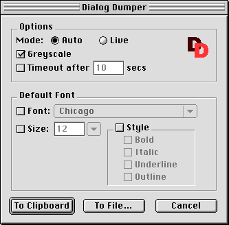
See elsewhere in this User Guide for details of the meanings of the settings. Make your settings and then click To Clipboard to write the script to the clipboard, or To File... to write the script to a file of your choosing. If the script is written to a file then any existing file will be completely overwritten. Any settings you make are preserved and re-presented the next time a file is to be processed. Dialog Dumper stays open after processing a file so it does not need to be re-launched each time it is needed. If the Live Mode option is selected then the script generated contains a loop that repeats until a push button in the dialog or the window's close box is clicked.
set dlog to {size:[320, 95], contents:[
	{class:push button, bounds:[250, 65, 310, 85], name:"OK"},
	{class:push button, bounds:[170, 65, 230, 85], name:"Cancel"},
	{class:static text, bounds:[10, 10, 310, 10 + 32], contents:"A very simple dialog box."}]
		}

set dVals to dd auto dialog dlog
|
This creates a small dialog window in the centre of the main screen containing some static text above OK and Cancel push buttons.
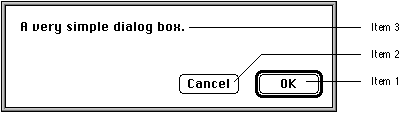
The OK push button is item 1, the Cancel push button is item 2, and the static text is item 3 because that is the order they are defined in dlog's contents list. Clicking the OK button yields the result:
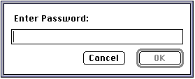
property dPassword : {size:[260, 95], contents:[
	{class:push button, bounds:[190, 65, 250, 85], name:"OK", enabled:3},
	{class:push button, bounds:[110, 65, 170, 85], name:"Cancel"},
	{class:password field, bounds:[10, 36, 250, 36 + 16], name bounds:
		[10, 10, 250, 26], name:"Enter Password:", value:""}]
	, timeout after:60}

set [ok, cancel, thePassword] to dd auto dialog dPassword

if ok then
	display dialog thePassword -- OK was pressed
else if cancel then
	beep -- Cancel was pressed
else
	display dialog "The dialog timeout was reached." -- Timeout
end if
|
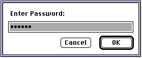
This creates a small dialog window in the centre of the main screen containing a password field below a prompt and below that are two push buttons. The OK button has a default border and is greyed out/disabled until some text is entered into the password field.
If no push button is pressed within 60 seconds the dialog is automatically dismissed as specified by the timeout after:60 property. Note that this example has the dialog record (dPassword) defined as a property as opposed to the variable used in example 1.
This helps speed up execution but only where the dialog record is constant. The dialog window should initially look like this:
{true, false, null, {416, 397, 736, 492}}	-- [ OK button, Cancel button, static text, dialog window's bounds ]

Clicking the Cancel button yields the result:

{false, true, null, {416, 397, 736, 492}}
|
As you can see, dd auto dialog returns a list of four items, one for each dialog item passed to it via the contents property and one that represents the final bounding rectangle of the dialog window. In this example the third item will always be null because static text items have no value property.
The values of items 1 and 2 allow you to determine which push button was used to dismiss the dialog. The dismissing push button always returns true (whether invoked via the mouse or keyboard), and all other push button's return false. This allows you to write the following sort of code:
set dVals to dd auto dialog dlog if item 1 of dVals then -- OK was pressed else if item 2 of dVals then -- Cancel was pressed end if Alternatively you can write the code like this: set [ok, cancel] to dd auto dialog dlog if ok then -- OK was pressed else if cancel then -- Cancel was pressed end if |
Note that in this example the OK button (being the first push button) defaults to the default button and the second push button defaults to the cancel/escape button. These could be reversed by including default item:2 in the dialog record passed to dd auto dialog.
After typing some text and selecting it the dialog window might appear as below. Note that any character typed will appear as a bullet, and that the OK button is now enabled.
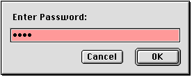
Changing the above script to set the grayscale parameter to true and the initial value of the password field item to "Test":
	...
	{class:password field, bounds:[10, 36, 250, 36 + 16], name bounds:
		[10, 10, 250, 26], name:"Enter Password:", value:"Test"}]
	...

get dd auto dialog dPassword with grayscale
|
should produce a dialog window that initially looks like this (if the Appearance Manager is installed):
All the example scripts expect that Dialog Director v0.7 and all the standard scripting additions are correctly installed in the "Scripting Additions" folder. Additionally all examples are working and designed to be run from within Script Editor unless otherwise stated.
| File | Description | Requires |
|---|---|---|
| Alert.as | Utility handler that Displays a new (Mac OS 8) style alert. | |
| Calc Total.as | Dialog that calculates the total of 5 text fields containing numbers. Includes error handling and user feedback. | |
| Check List.as | Displays a list which when double-clicked toggles on & off check marks. Returns a list of the checked items' indexes. | |
| ChooseList.as | Utility handler that given a list returns the user's selection. | |
| Currency Converter.as | Enter an amount in a foreign currency and an exchange rate and hit enter. | |
| Currency Converter.rsrc | The resources used by Dialog Dumper to create the above. | ResEdit |
| Current App.as | A simple floating window that displays the name of the app it's running in and that of the front most app. | GTQ Scripting Lib's Application Info osax |
| Database.as | An incomplete database user interface system that given a few properties will automatically construct a suitable dialog. | |
| DD Connect To.as | Based on Apple's, Mac OS 8, "Connect To..." applet. This displays a modeless window which can be left open with an editable, saveable, loadable list of your favourite URLs. | Mac OS 8 / Internet Scripting osax and Internet Config |
| DD Connect To... | The ready to run applet version of the above script. | Mac OS 8 |
| Default Button.as | Demos the effect of different settings of the 'default item' dialog property. | |
| DisplayDialog.as | A simple "display dialog" like utility handler. | |
| Documents+ | The ready to run applet version of the script below. For best results copy and rename before using. | |
| Documents+.as | A floating palette displaying 12 buttons waiting for you to place your favourite applications & documents. | |
| EditFontSpec.as | A utility handler that given a Font Spec record presents a dialog that allows the user to edit the record and then returns a new one. Deals with font style as a number, name or name list and validation and error reporting of user entered font size. | |
| Expand.as | A simple progress window that may be expanded while running to show additional, dynamically updated, info. | |
| Expand.rsrc | The resources used by Dialog Dumper to create the above. | ResEdit |
| Flashing Text.as | A "Hello World!" example that you can't possibly ignore! | |
| FMP Browser | The ready to run applet version of the script below. | FileMaker Pro 3 or 4 |
| FMP Browser.as | A floating palette for FileMaker Pro that provides record navigation services for all FMP databases. Additionally if a database contains a calc. cell: "Index"=Status(CurrentRecordNumber), then it also displays "record-number of record-count" record info. | FileMaker Pro 3 or 4 |
| Gauge (Auto).as | An auto dialog that demos gauges and named actions that access global properties and modify the active dialog. | |
| Gauge (Live).as | A live dialog version of the above. | |
| GetFontSpec.as | Presents a dialog that allows the user to define a Font Spec record which is then returned. | |
| Growing Text.as | If "Flashing Text.as" didn't catch your attention then this should! | |
| HTML Palette | The ready to run applet version of the script below. | ClarisWorks 4 & Jon's Commands osax |
| HTML Palette.as | A floating palette for ClarisWorks supplying HTML tag insertion. | ClarisWorks 4 & Jon's Commands osax |
| Icon Buttons.as | A plethora of icon buttons. The ultimate icon button demo. | |
| IconListDemo.as | Demos icon list box, multi-column list box and dynamically setting the value of a list box/icon list box. | |
| Icons & Picts.as | Shows how to read icons and pictures from a resource file for inclusion in a dialog. | Resource Utilities osax |
| Icons & Picts.rsrc | The resources used by the above script. | ResEdit |
| Internet Assistant.as | Complex interview style demo using multiple dialog pages (via dd create/dd delete), polygon buttons & consistent text styles. | |
| Kibbles.as | Demos a stoppable, progressive, task and the Alert() handler. | |
| List Demo.as | Demos how to construct/de-construct a sub-list from a main list. | |
| Menu+.as | Similar to the script below but plus a text field item? | |
| Menu.as | A utility handler that, given a list, presents a dialog containing an array of up to 20 radio buttons, and returns the user's selection. | |
| Message.as | A window that scrolls a message across the screen. | |
| More Choices.as | Demos a dialog that has a "More Choices" button that adds items to the dialog, repositions others to make space and renames itself to "Fewer Choices". This button then deletes the added items and resets the positions of the moved items. | |
| More Choices.rsrc | The resources used by Dialog Dumper to create the above. | ResEdit |
| More Lists.as | Demos how to create a multi-column list that can be sorted by clicking a column title. Includes code for doing a fast sort of a list of lists using any item as the sort key. | |
| Multi-Column Lists.as | Displays a dialog containing 2 list boxes with the same contents. The first is single column, the second is multi-column. Also demos use of font specs. | |
| Multi-Dialogs.as | Creates multiple dialog windows which are all live. | |
| Name & Password.as | Simple dialog box that requires entry of a name and password before the OK button is enabled or the dialog times out. | |
| Noughts & Crosses.as | An example of an Os and Xs game for 2 players. | |
| Open In Bkgnd.as | Illustrates which window styles may be opened in a background application without that app requesting attention from the user. | |
| Password.as | The essential "hidden password" dialog (in white and greyscale). | |
| Pets+.as | A improved pets dialog. | |
| Pets.as | The original pets dialog. | |
| Poly Buttons.as | Demos various transparent polygon button classes. | |
| Pop-Up Menus.as | Demos both "standard" and "type-in" style pop-up menus. | |
| PPPalette.as | A floating palette that allows the opening & closing and display the status of your PPP internet connection. | Open Transport/PPP and Apple's PPP Commands osax |
| Progress.as | A set of four progress dialog utility handlers and a demo. | |
| Progress 1.as | A very simple progress dialog. | |
| Progress 2.as | Another simple progress dialog. | |
| QuickTime.as | A simple demo that plays a QuickTime movie of your choice. | QuickTime |
| Remember Pos.as | Shows the correct way to remember the last position of a window and restore it the next time the window is opened which is not affected by the screen size of the Mac used to compile the script. | |
| ResBrowser.as | Displays a pop-up menu of the resource type in a given file and a multi-column list box describing each resource. | Resource Utilities osax |
| SaveChanges.as | A utility handler that presents a standard "Save Changes" dialog. | |
| Search osaxen.as | Based on Gregory Charles Rivers's original script. This script searches the current scripting additions for a word (or partial word) and displays the results in a dynamically constructed dialog that grows to fit the results. | programmer's tool osax and Scriptable Finder |
| Set Folder Windows | The ready to run droplet version of the script below. | Scriptable Finder |
| Set Folder Windows.as | Andy Bachorski's script with a DD user interface by me. | Scriptable Finder |
| Set Name.as | Script that makes buttons move about! | |
| Show Text | Server applet version of "Show Text.as". | |
| Show Text Client.as | Client script for the above "Show Text" server applet. | |
| Show Text.as | When used with the client script above shows that you can send messages to the script of an applet displaying an auto dialog. | |
| Simple 2.as | A simple auto dialog called twice with different "default item"s. | |
| Simplest.as | The essential basic auto dialog. | |
| Sorted!.as | Shows how to edit the contents of a list using a list box and do a fast sort on it to produce a second (destination) list. | |
| SuperCT2 | The ready to run droplet version of the script below. | Scriptable Finder |
| SuperCT2.as | The latest incarnation of the ultimate AS file creator/type editor. | Scriptable Finder |
| Switch Apps.as | Presents a list box containing the currently running apps and activates the one chosen by the user. | Scriptable Finder |
| Sys Folder.as | Select an item in the System Folder! | |
| Test.as | A window that floats above the Finder demonstrating a mishmash of DD features (including a surprising one). | |
| Timeout.as | A script that demos the timeout feature and reports the results. | |
| *dd uninstall.as | A utility script that is handy to keep open in your script editor. To be run if an erroneous script that you are developing exits leaving any DD windows lying around. |
dd install -- plus any options try <code to manage my Dialog Director windows> dd uninstall on error dd uninstall end try |